Piwigo 2.10: what’s up with the latest update?

If you are a Piwigo user, you may have received an email announcing that Piwigo 2.10 has been deployed on your account. What does this update change for you?
Some already know it, Piwigo reaches a new stage with the release of the 2.10 version. It is the first step for a new Piwigo, redesigned according to current standards. Here are the main changes brought by this new version.
A fresh look for your gallery
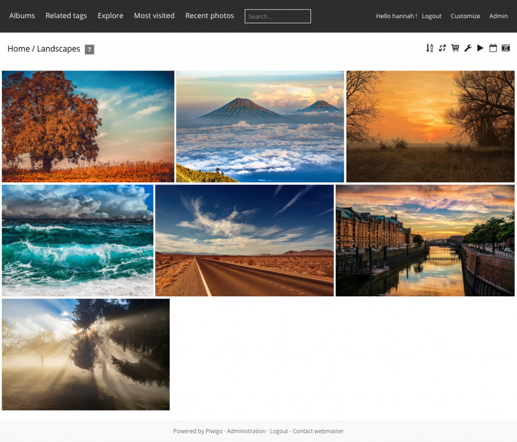
This new feature has been deployed in advance, as we were mentioning in this blog post : Modus becomes the default theme on Piwigo 2.10. It has the particularity of being responsive, i.e. it automatically adapts to small screens such as a phone or large screens such as a TV. It comes with 8 new modern styles: we encourage you to test it on your gallery.

An overall redesign for the administration
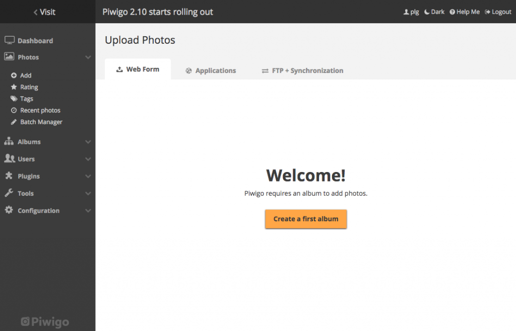
The 2.10 starts a very important project, the redesign of the Piwigo administration. New header, menu and tabs. Fewer borders, more spaces. The dashboard, photo upload form and album manager have been redesigned.

New features
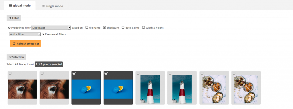
As always, version 2.10 comes with many new features to simplify your life as a user: improved sorting of duplicates, possibility to make sub-albums public in one click, display of album dates, progressive synchronization of metadata…

Discover in details the new features of Piwigo 2.10 with our illustrated release notes!
And if you have any question or issue about this update, feel free to contact the support at the usual email adress.
Thanks in advance for all your hard work. PIWIGO is the best!! Have a nice holiday season!
Does this impact the lightroom integration with Piwigo?
Personally, I preferred the old, compact version with clean lines – much more orderly, and you could see everything at once. Too much scrolling and clicking now: functional and efficient is far more important than pretty